#CSS properties
Explore tagged Tumblr posts
Visit Tumblr Blog
Explore Tumblr blogs with no restrictions, modern design and the best experience.
Last Seen Tumblr Blogs


Fun Fact
In 2020, Tumblr had 29.4 million users in the US.
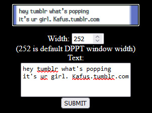
Text
Propiedades de las Cajas o Bloques en HTML y su Importancia
En HTML, todos los elementos, desde un simple párrafo hasta una imagen compleja, se representan como cajas. Estas cajas tienen propiedades que nos permiten controlar su tamaño, posición, espaciado y otros aspectos visuales. Comprender estas propiedades es fundamental para crear diseños web personalizados y atractivos. ¿Qué es el Modelo de Caja en CSS? El modelo de caja es una representación…
#CSS#css box model#CSS layout#CSS properties#desarrollo web#diseño responsive#Diseño web#Diseño web personalizado#Flexbox#Grid#Guía CSS#HTML#layout#Modelo de caja CSS#Posicionamiento CSS#propiedades CSS#Tutorial CSS#z-index
1 note
·
View note
Text
PureCode AI review | To further understand advanced CSS properties
To further understand advanced CSS properties for shape design, we will explore the clip-path property, CSS transform for shape distortion, and the role of aspect ratio in responsive shapes.
#PureCode AI review#CSS properties#aspect ratio#responsive shapes.#purecode#purecode ai company reviews#purecode software reviews#purecode ai reviews#purecode reviews#purecode company
0 notes
Text
in order to introduce anything new to me you have to leave it on the floor so i can sit at a distance and stare at it until i work up the courage to cautiously sniff at it and then dart away and stare at it again. until i get used to it
#rot.txt#this post is about me finding new css properties. i am Suspicious of them (it has no reason to be suspicious of css properties)
3 notes
·
View notes
Text
Weekly News for Designers № 719
New Post has been published on https://thedigitalinsider.com/weekly-news-for-designers-%e2%84%96-719/
Weekly News for Designers № 719
Figma AI Updates to Elevate Your Design Workflow Figma has shared some prototypes for platform updates that integrate AI. This Tuts+ article covers each of them to explore their possibilities.
State of Brand Report 2023 Discover key insights into the trends, challenges and strategies of branding this year.
Internet Artifacts Explore artifacts from the early days of the internet right up until the present day.
Naming Variables In CSS Some collected thoughts from Jonathan Dallas related to naming CSS Custom Properties.
The Negative Impact of Mobile-First Web Design on Desktop Mobile-first web designs cause significant usability issues when viewed on desktop.
Free T-Shirt Mockup Templates for Photoshop These free realistic iPhone mockup templates are perfect for showcasing the UI or UX of your mobile app design or responsive website.
Introducing Learn Performance Course This is new and free course is intended for those that care about web performance, but may be just beginning to get familiar with it.
It’s 2023, Here is Why Your Web Design Sucks Heather Buchel explores the reasons why we no longer have web designers.
State of React 2023
Let’s Reinvent the Wheel
The 2023 Design Tools Survey This survey gathers usage data from thousands of designers each year and many of the design companies you know use this data to better understand and improve the design tools industry.
CSS & JavaScript Snippets for Creating Notification UIs A collection of CSS and JavaScript code snippets for creating unique notification and alert systems and UIs.
Image Layer Animations with Clip-Path Some ideas for speedy page transition animations with layered images using clip-path.
Common Questions About Interpreting Page Speed Reports Take a closer look at how various performance tools audit and report on performance metrics, such as core web vitals.
Geist Font A new and free typeface that has been specifically designed for developers and designers.
Photoshop Action Sets for Cinema & Movie Effects A collection of one-click cinema & movie effect Photoshop action sets that will take your photos to the next level.
#2023#ai#amp#animations#app#Article#audit#Branding#clip-path#code#Companies#course#CSS#custom properties#data#Design#Designer News#designers#desktop#developers#effects#figma#how#Ideas#images#Industry#insights#Internet#iPhone#issues
2 notes
·
View notes
Text
it's funny doing indie web and worrying about cache busting and versioning css and oough the average user doesn't know how to hard refresh a page. and then you're like wait. no one's gonna see this
1 note
·
View note
Text
People who don't know much about web dev will go "fuck jQuery and the enshittification of the internet! Modern sites are bloated and inaccessible!" (which, to be fair, is true) and then go on to add so many unnecessary iframes to their neocities pages that the latest version of Firefox struggles to render them
#i promise using the display: grid css property will not suddenly turn you into a silicon valley corpobro#tangentially related:#i remember seeing someone boasting that their browser game was ''handcoded javascript''#ah yes i only visit websites that make use of ethically harvested small batch fair trade javascript
1 note
·
View note
Text
Valcan Facades: Elevate Your Building's Style & Performance
Take your building's design to new heights with Valcan Facades, expertly crafted and installed by CSS CLADDING LTD. Our innovative facade solutions seamlessly blend aesthetics and functionality, ensuring your property stands out.
Valcan Facades offer:
- Unique designs tailored to your vision
- Unmatched durability and weather resistance
- Energy-efficient solutions for a sustainable future
- Enhanced acoustic performance and reduced noise pollution
- Increased fire resistance and safety
- Comprehensive project management and after-sales support
#css cladding ltd#building design#facade solutions#energy efficiency#durability#property value#curb appeal.
0 notes
Text
coding themes where you can't control the html is kind of enriching actually
#花話#css grid and flex properties doing a lot of heavy lifting here lol#but also stuff like :has() and :not() doing perhaps even more when it comes to making layouts responsive#n rearranging items when other modules are introduced into the frame#anyway been coding a dw theme from scratch for funsies basically n i have to consider how it looks on the various#different pages with all the different modules that can be turned on n off hehe#n also have to consider how to keep it responsive for mobile layouts n stuff... is a fun challenge in selectors
0 notes
Text

updates
making website :3

its not supposed to fucking look like that
#note: the green thing is like. a box where all the content is and the black thing with the green sparkles is a background for that box#i can prolly fuck around with the overflow property or something. idk. im not that good at css lmao
6 notes
·
View notes
Text
Purecode reviews | The clip-path property in CSS
The clip-path property in CSS is a crucial tool for creating complex shapes. By clipping an element to a basic shape or an SVG source, you can craft aesthetic designs that are unique to your brand.
#clip-path property#CSS#craft aesthetic designs#SVG source#creating complex#purecode company#purecode reviews#purecode software reviews#purecode ai reviews#purecode ai company reviews#purecode
0 notes
Text
people who know a lot about css are scary in the way i imagine people were scared of witches and warlocks. when they start pulling out functions and custom properties and shit in the style.css youre kind of stuck within a spell until they explain or scroll away
130 notes
·
View notes
Text
What We Know (So Far) About CSS Reading Order
New Post has been published on https://thedigitalinsider.com/what-we-know-so-far-about-css-reading-order/
What We Know (So Far) About CSS Reading Order

The reading-flow and reading-order proposed CSS properties are designed to specify the source order of HTML elements in the DOM tree, or in simpler terms, how accessibility tools deduce the order of elements. You’d use them to make the focus order of focusable elements match the visual order, as outlined in the Web Content Accessibility Guidelines (WCAG 2.2).
To get a better idea, let’s just dive in!
(Oh, and make sure that you’re using Chrome 137 or higher.)
reading-flow
reading-flow determines the source order of HTML elements in a flex, grid, or block layout. Again, this is basically to help accessibility tools provide the correct focus order to users.
The default value is normal (so, reading-flow: normal). Other valid values include:
flex-visual
flex-flow
grid-rows
grid-columns
grid-order
source-order
Let’s start with the flex-visual value. Imagine a flex row with five links. Assuming that the reading direction is left-to-right (by the way, you can change the reading direction with the direction CSS property), that’d look something like this:
Now, if we apply flex-direction: row-reverse, the links are displayed 5-4-3-2-1. The problem though is that the focus order still starts from 1 (tab through them!), which is visually wrong for somebody that reads left-to-right.
But if we also apply reading-flow: flex-visual, the focus order also becomes 5-4-3-2-1, matching the visual order (which is an accessibility requirement!):
<div> <a>1</a> <a>2</a> <a>3</a> <a>4</a> <a>5</a> </div>
div display: flex; flex-direction: row-reverse; reading-flow: flex-visual;
To apply the default flex behavior, reading-flow: flex-flow is what you’re looking for. This is very akin to reading-flow: normal, except that the container remains a reading flow container, which is needed for reading-order (we’ll dive into this in a bit).
For now, let’s take a look at the grid-y values. In the grid below, the grid items are all jumbled up, and so the focus order is all over the place.
We can fix this in two ways. One way is that reading-flow: grid-rows will, as you’d expect, establish a row-by-row focus order:
<div> <a>1</a> <a>2</a> <a>3</a> <a>4</a> <a>5</a> <a>6</a> <a>7</a> <a>8</a> <a>9</a> <a>10</a> <a>11</a> <a>12</a> </div>
div display: grid; grid-template-columns: repeat(4, 1fr); grid-auto-rows: 100px; reading-flow: grid-rows; a:nth-child(2) grid-row: 2 / 4; grid-column: 3; a:nth-child(5) grid-row: 1 / 3; grid-column: 1 / 3;
Or, reading-flow: grid-columns will establish a column-by-column focus order:
reading-flow: grid-order will give us the default grid behavior (i.e., the jumbled up version). This is also very akin to reading-flow: normal (except that, again, the container remains a reading flow container, which is needed for reading-order).
There’s also reading-flow: source-order, which is for flex, grid, and block containers. It basically turns containers into reading flow containers, enabling us to use reading-order. To be frank, unless I’m missing something, this appears to make the flex-flow and grid-order values redundant?
reading-order
reading-order sort of does the same thing as reading-flow. The difference is that reading-order is for specific flex or grid items, or even elements in a simple block container. It works the same way as the order property, although I suppose we could also compare it to tabindex.
Note: To use reading-order, the container must have the reading-flow property set to anything other than normal.
I’ll demonstrate both reading-order and order at the same time. In the example below, we have another flex container where each flex item has the order property set to a different random number, making the order of the flex items random. Now, we’ve already established that we can use reading-flow to determine focus order regardless of visual order, but in the example below we’re using reading-order instead (in the exact same way as order):
div display: flex; reading-flow: source-order; /* Anything but normal */ /* Features at the end because of the higher values */ a:nth-child(1) /* Visual order */ order: 567; /* Focus order */ reading-order: 567; a:nth-child(2) order: 456; reading-order: 456; a:nth-child(3) order: 345; reading-order: 345; a:nth-child(4) order: 234; reading-order: 234; /* Features at the beginning because of the lower values */ a:nth-child(5) order: -123; reading-order: -123;
Yes, those are some rather odd numbers. I’ve done this to illustrate how the numbers don’t represent the position (e.g., order: 3 or reading-order: 3 doesn’t make it third in the order). Instead, elements with lower numbers are more towards the beginning of the order and elements with higher numbers are more towards the end. The default value is 0. Elements with the same value will be ordered by source order.
In practical terms? Consider the following example:
div display: flex; reading-flow: source-order; a:nth-child(1) order: 1; reading-order: 1; a:nth-child(5) order: -1; reading-order: -1;
Of the five flex items, the first one is the one with order: -1 because it has the lowest order value. The last one is the one with order: 1 because it has the highest order value. The ones with no declaration default to having order: 0 and are thus ordered in source order, but otherwise fit in-between the order: -1 and order: 1 flex items. And it’s the same concept for reading-order, which in the example above mirrors order.
However, when reversing the direction of flex items, keep in mind that order and reading-order work a little differently. For example, reading-order: -1 would, as expected, and pull a flex item to the beginning of the focus order. Meanwhile, order: -1 would pull it to the end of the visual order because the visual order is reversed (so we’d need to use order: 1 instead, even if that doesn’t seem right!):
div display: flex; flex-direction: row-reverse; reading-flow: source-order; a:nth-child(5) /* Because of row-reverse, this actually makes it first */ order: 1; /* However, this behavior doesn’t apply to reading-order */ reading-order: -1;
reading-order overrides reading-flow. If we, for example, apply reading-flow: flex-visual, reading-flow: grid-rows, or reading-flow: grid-columns (basically, any declaration that does in fact change the reading flow), reading-order overrides it. We could say that reading-order is applied after reading-flow.
What if I don’t want to use flexbox or grid layout?
Well, that obviously rules out all of the flex-y and grid-y reading-flow values; however, you can still set reading-flow: source-order on a block element and then manipulate the focus order with reading-order (as we did above).
How does this relate to the tabindex HTML attribute?
They’re not equivalent. Negative tabindex values make targets unfocusable and values other than 0 and -1 aren’t recommended, whereas a reading-order declaration can use any number as it’s only contextual to the reading flow container that contains it.
For the sake of being complete though, I did test reading-order and tabindex together and reading-order appeared to override tabindex.
Going forward, I’d only use tabindex (specifically, tabindex="-1") to prevent certain targets from being focusable (the disabled attribute will be more appropriate for some targets though), and then reading-order for everything else.
Closing thoughts
Being able to define reading order is useful, or at least it means that the order property can finally be used as intended. Up until now (or rather when all web browsers support reading-flow and reading-order, because they only work in Chrome 137+ at the moment), order hasn’t been useful because we haven’t been able to make the focus order match the visual order.
#Accessibility#Articles#Behavior#change#chrome#columns#container#Containers#content#CSS#CSS-Properties#direction#display#Features#focus#grid#grid-template-columns#guidelines#how#HTML#html elements#it#layout#links#mind#Moment#nth-child#One#Other#prevent
0 notes
Text
Update: you can now change your soul mode (change your cursor on the website) by clicking on the heart button at the bottom of the page

I made a countdown in case you want to count down to tomorrow every day until deltarune releases (rouxls is there too)
#I mean the button is also there on mobile but it doesn't do much lol#I also changed a bunch of other stuff#for example: lancer isn't blurry anymore. thank you css property image-rendering#I'm having fun with this. I'll probably stop adding stuff soon though bc I have other things to do
20 notes
·
View notes
Text
yesterday i randomly remembered that a WHILE back i was messing with making gen 4 styled text boxes in HTML/CSS and i ended up totally forgetting about it until now. idk why i started this but now that i've remembered it i want to add all the different window types in gen 4 lmao. i also cleaned up the CSS a bit. fun little side project ig. i'm gonna work on the other window types after i eat bc it requires image editing for the border-image property jiosdfj
79 notes
·
View notes